Exchange Express
Exchange Express
UX Case Study
UX Case Study
Responsive Currency Exchange Website for
Global Travelers
Overview
Planning my first solo trip was filled with excitement, but also some anxieties. One of these anxieties involved navigating the unfamiliar world of currency exchange.
I found the information available on various websites to be scattered and challenging to navigate. This experience sparked an idea:
Could I design a user-friendly and informative website specifically tailored to the needs of travelers seeking to exchange currency?
My Aim..
My goal was to create an intuitive, visually appealing interface that simplifies the currency exchange process for individuals seeking swift and secure services. By focusing on user needs and ensuring accessibility, the design aims to foster trust across diverse demographics.
My goal was to create an intuitive, visually appealing interface that simplifies the currency exchange process for individuals seeking swift and secure services. By focusing on user needs and ensuring accessibility, the design aims to foster trust across diverse demographics.
How I approached this…
DEFINE
DEFINE
To understand the target audience, I conducted research and analyzed the findings.
To understand the target audience, I conducted research and analyzed the findings.
DESIGN
DESIGN
To visualize the user interface structure and layout, I created low-fidelity wireframes.
To visualize the user interface structure and layout, I created low-fidelity wireframes.
DEVELOP
DEVELOP
I refined the user interface by developing high-fidelity visual elements.
I refined the user interface by developing high-fidelity visual elements.
DEPLOY
DEPLOY
To evaluate the design's effectiveness, I conducted usability testing with real users.
To evaluate the design's effectiveness, I conducted usability testing with real users.
01 Define
01 Define
Understanding Traveler Needs
I wanted the user to feel empowered and in control throughout their entire currency exchange journey. This meant streamlining the process from start to finish:
I wanted the user to feel empowered and in control throughout their entire currency exchange journey. This meant streamlining the process from start to finish:
Travel, Exchange, Done.
All participants found it annoying to switch between sites to find best rates, local currency, ATM's, exchange centers etc., So I eliminated the need for users to search for information across different sources, so that, All aspects of the exchange, from planning to transaction, can be completed in a single platform.
All participants found it annoying to switch between sites to find best rates, local currency, ATM's, exchange centers etc., So I eliminated the need for users to search for information across different sources, so that, All aspects of the exchange, from planning to transaction, can be completed in a single platform.

Ease and Convenience
Participants often sought a website or service that is easy to navigate and understand and also compared different providers to find the most favorable exchange rates in order to optimize their budget. So keeping the clutter free and intuitive while having all features was crucial.
Participants often sought a website or service that is easy to navigate and understand and also compared different providers to find the most favorable exchange rates in order to optimize their budget. So keeping the clutter free and intuitive while having all features was crucial.

Transparency and Trust
Participants were often surprised and frustrated by hidden fees and unsecure platforms. Hence, Clear and accurate exchange rates with Transparent fees and Secure Transaction was incorporated.
Participants were often surprised and frustrated by hidden fees and unsecure platforms. Hence, Clear and accurate exchange rates with Transparent fees and Secure Transaction was incorporated.
Information and Accessibility
Participants were often surprised and frustrated by hidden fees and unsecure platforms. Hence, Clear and accurate exchange rates with Transparent fees and Secure Transaction was incorporated.
Participants were often surprised and frustrated by hidden fees and unsecure platforms. Hence, Clear and accurate exchange rates with Transparent fees and Secure Transaction was incorporated.
02 Design
02 Design
Wireframing the Solution
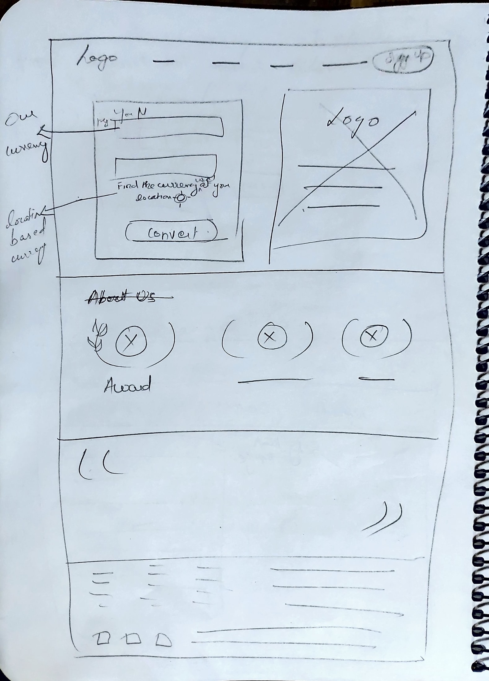
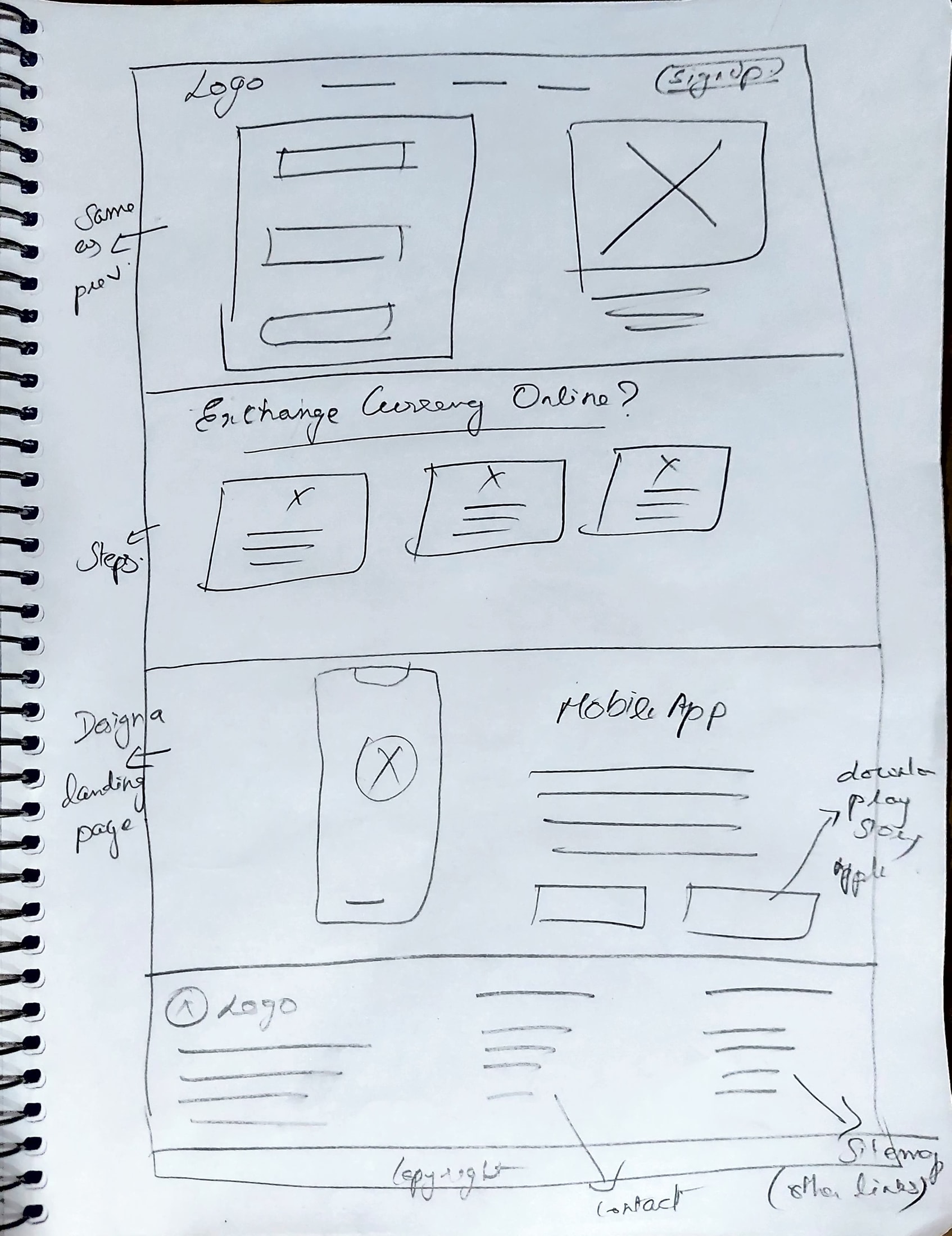
The next step was to translate the research findings into Wireframes. But before stepping onto the digital lo-fi wireframes, I decided to do the CRAZY 8 method in hand sketches, which is my favorite for a reason. I get 8 different ideas that can be implemented under 1 min. Imagine spending 10 mins for hand sketches using this method. (do the math.. you get the idea right?)
I shortlisted those ideas by marking them and created a hand-sketch of the final outcome.


03 Develop
03 Develop
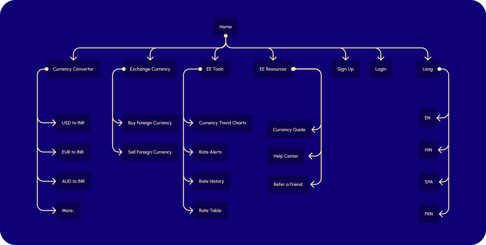
Structuring the User Journey
Next up, I focused on mapping out how the user navigates through the website, which is the crucial aspect because nailing the Information Architecture will determine the ease and convenience of the website and allow the user to access all the features of the website in an intuitive manner.
Next up, I focused on mapping out how the user navigates through the website, which is the crucial aspect because nailing the Information Architecture will determine the ease and convenience of the website and allow the user to access all the features of the website in an intuitive manner.
Visual Design Takes Shape
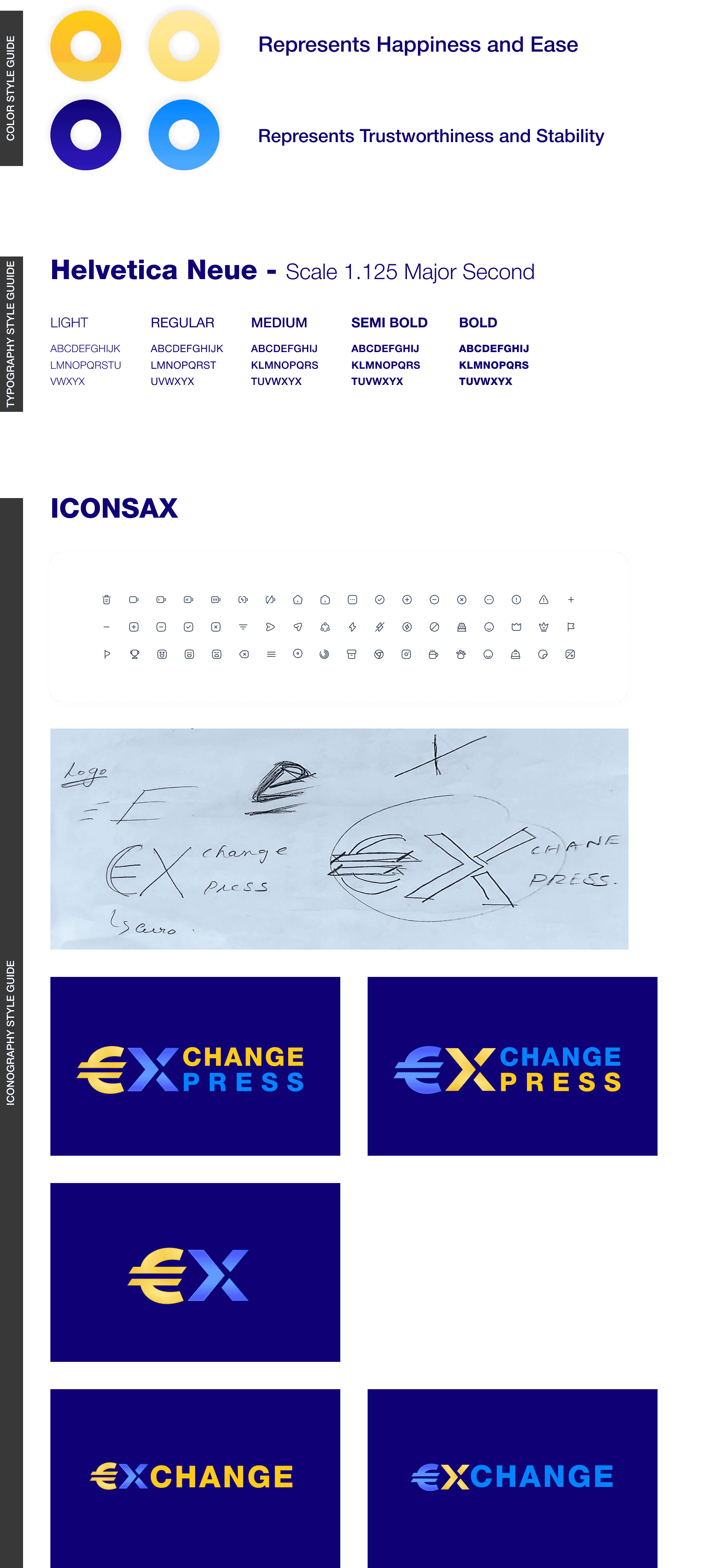
Extensive research on color theory, iconography and typography informed the development of the website's visual identity. I crafted a visually distinctive aesthetic that complements the user experience.
Visual design elements are essential in creating a positive and engaging user experience, as they contribute to the aesthetic appeal, usability, and overall effectiveness of a product or website thereby guiding user interaction, fosters comprehension, and reinforces a sense of professionalism and trust.
04 Deploy
04 Deploy
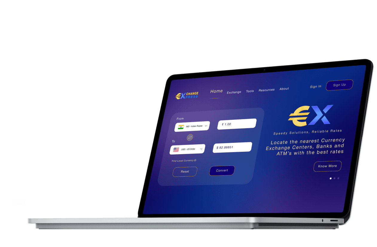
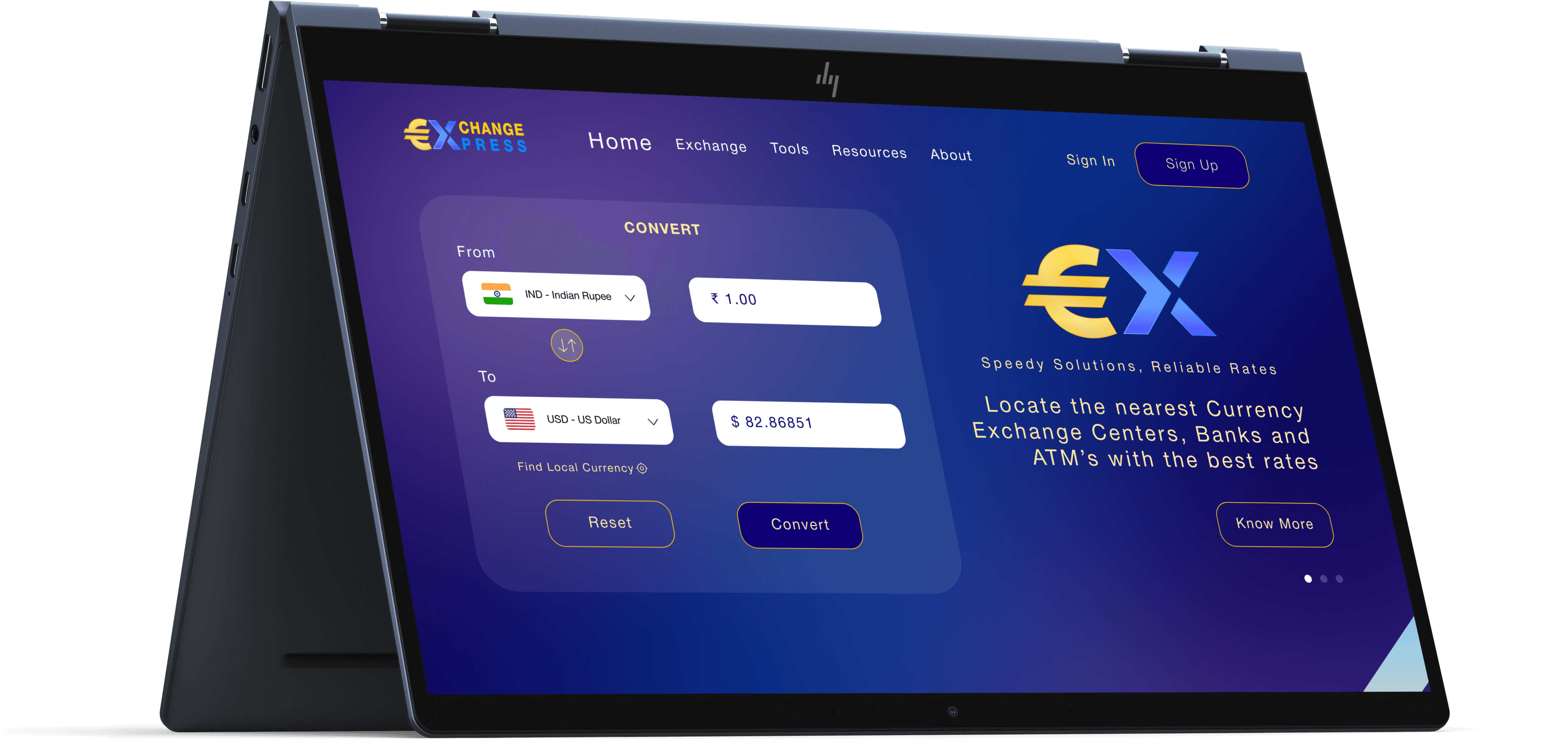
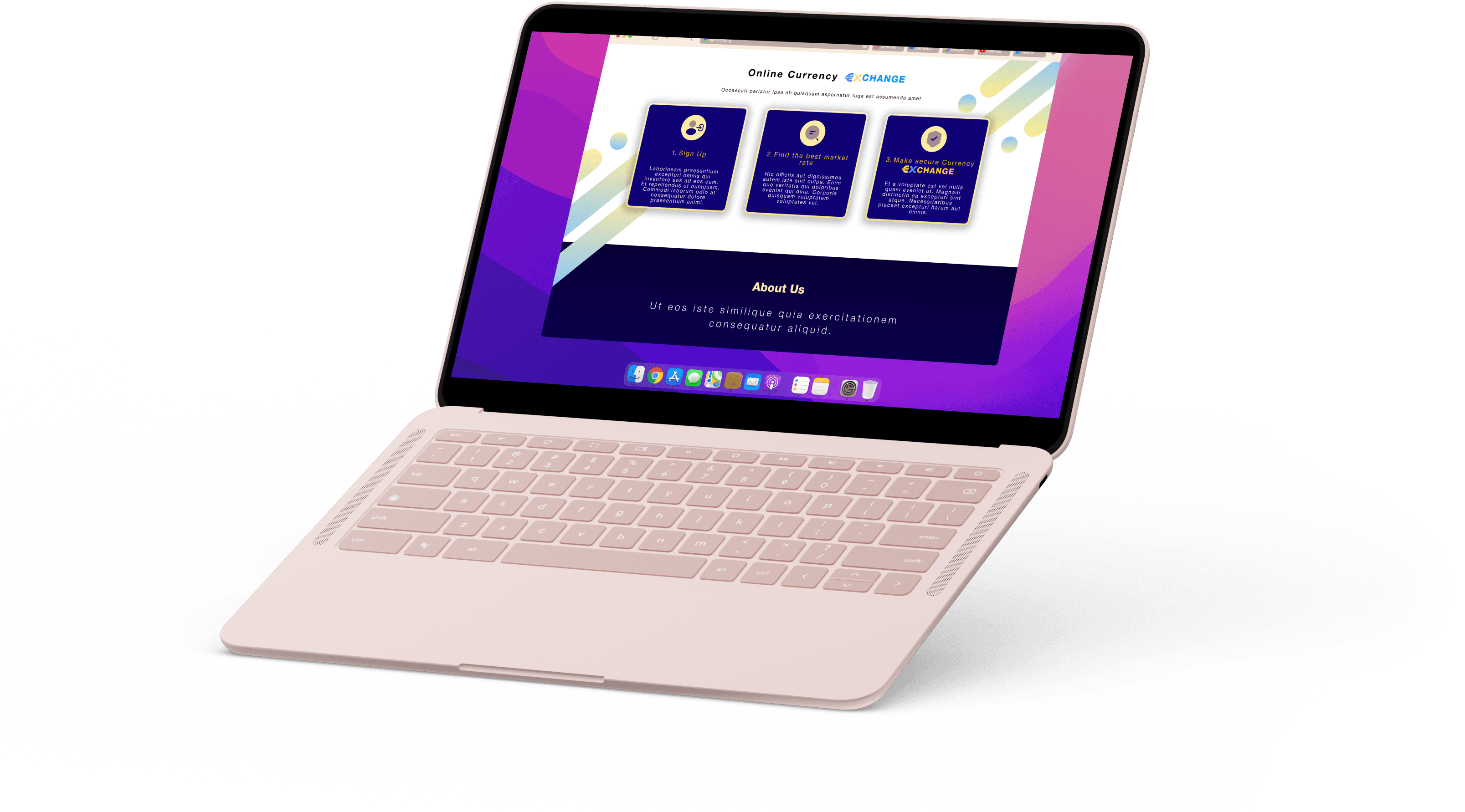
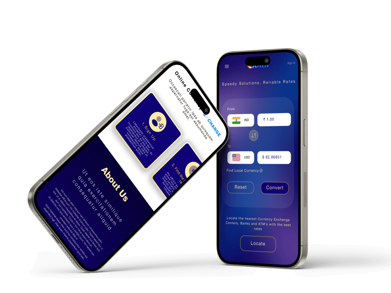
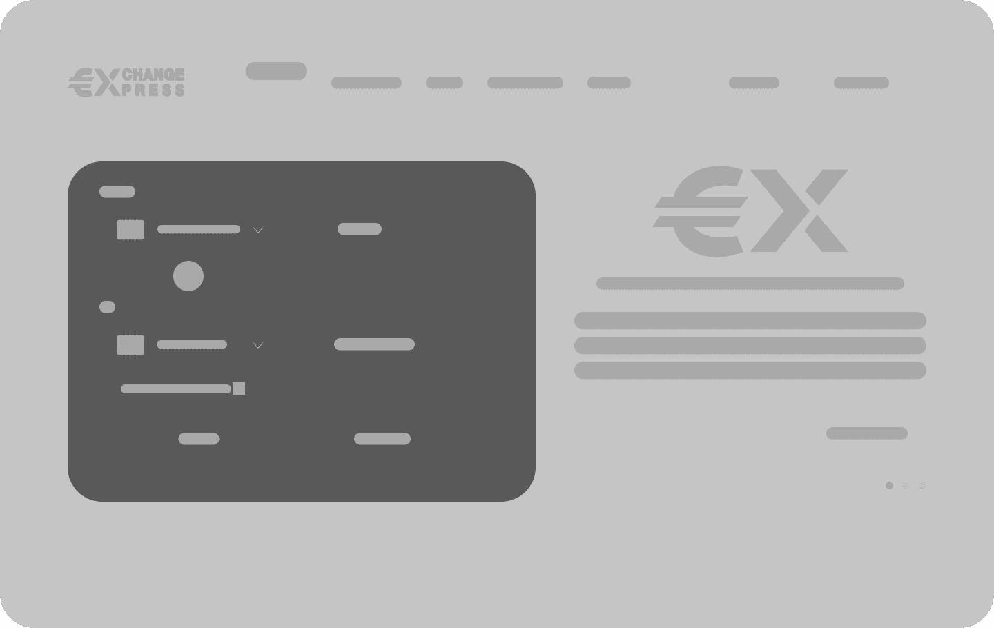
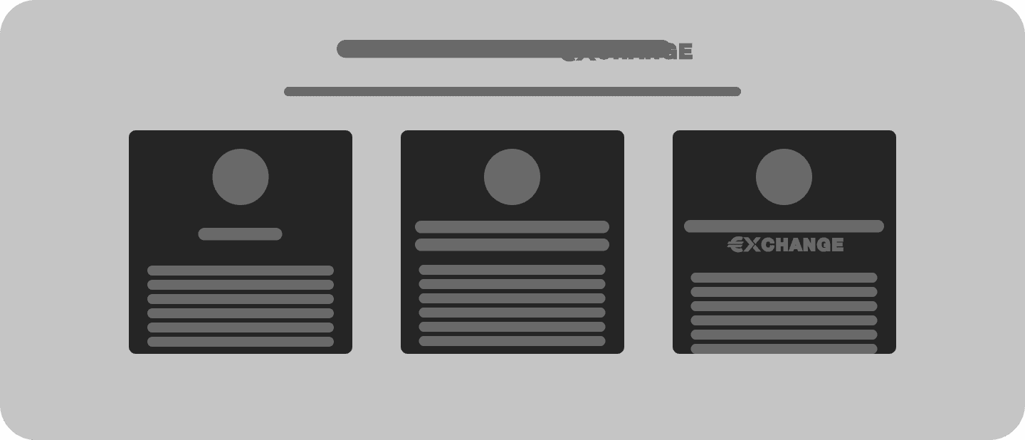
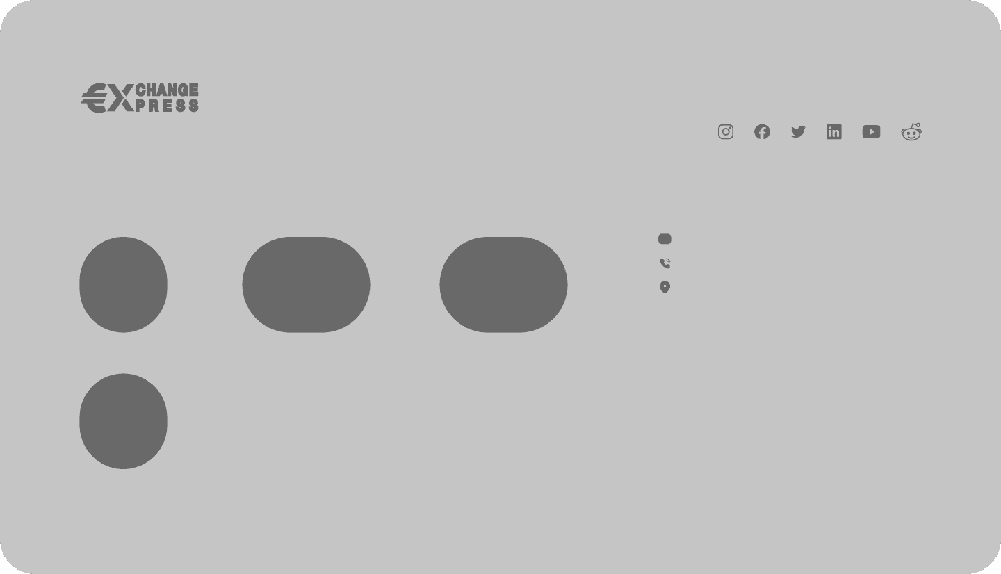
Visualizing the Solution
To bridge the gap between design concept and user experience, I created high-fidelity mockups. These detailed visuals provided a realistic representation of the website, allowing me to conduct thorough usability testing before development. This ensured the final product aligned with user needs and expectations from the very beginning.
To bridge the gap between design concept and user experience, I created high-fidelity mockups. These detailed visuals provided a realistic representation of the website, allowing me to conduct thorough usability testing before development. This ensured the final product aligned with user needs and expectations from the very beginning.